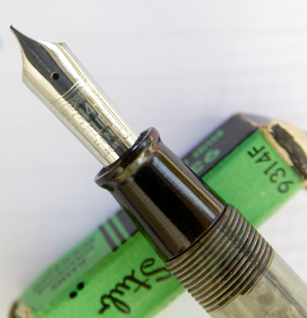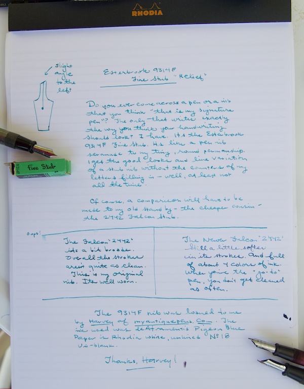
Do you ever come across a pen or a nib you think “this is my signature pen?” The one that makes your handwriting look better without doing anything but using it? That’s how I feel about the Esterbrook 9314F Relief Fine Stub. Its from the “higher end” line of nibs from Esterbrook, the Master series and I was lucky enough to borrow a NOS version from Harvey from the blog, My Antique Pens.

The 9314F has a nib that is flat at the tip like a stub but its angled slightly down to the left. I had previously fallen in love with the 2442 Falcon nibs which also have the angled nibs but this was my first opportunity to compare Durachrome (the 2000-series) to Master Points (the 9000-series) Renew nibs in a head-to-head. I guess its almost a head-to-head since there is also a 2314F nib that is labelled a “Fine Stub”. I am not sure what the difference is between the 2442 fine stub and the 2314F fine stub so I guess this is as close as I’ll get at the moment.

It became obvious when comparing the three nibs that my original, well-worn 2442 is definitely lost its crispness but it writes very smoothly and consistently. The NOS 2442 writes similarly to the 9314F but I noticed that the finest cross strokes were not quite as fine in the 2442.

I still feel like I’m learning about falcon nibs, this sub-category of nibs. Some say the Falcon (also called Relief) nib is designed for people who write with a backwards slant. Others say it was meant for left-handed writers. For a bit more information about Relief/Falcon-style Esterbrook nibs, this thread on FPN is quite enlightening.
What I discovered with all three of these nibs is that I can easily write with them and get a broader stroke with some pleasing thins without altering my left-handed, overhanded writing position. I often have difficulties with broad nibs entirely and wider stub nibs are a challenge as I can’t always get the nibs to make even contact with the paper. Ah, the challenges of lefties!

(A huge thank you to Harvey at My Antique Pens for letting me take this little rarity out for a spin)
(UPDATE: Corrected post title and link to Harvey’s blog. Sometimes, I swear I should not be allowed near a keyboard before 10am and a WHOLE pot of coffee!)
