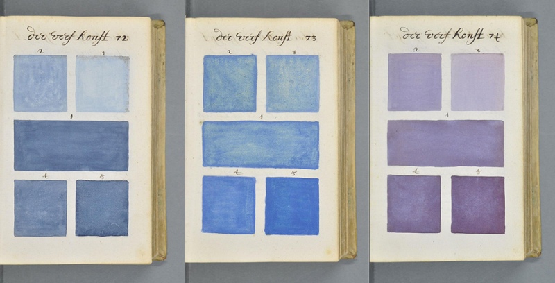
If you think we pen geeks get a little OCD about documenting our new fountain pen inks or testing papers in various notebooks, then you’ll appreciate this. In 1692 an artist created an 800-page handwritten book of paint swatches and documenting color at that time. Many comparisons are being made between this book and the modern day Pantone swatch books. Pretty epic, huh?
There are even more photos available to view, all collected in hi-rez though the server is clearly overburdened at present.
(via Colossal and linked from Erik Kwakkel. Thanks to Bob, Teri and everyone else who sent me the link)


This is awesome! And yes, it reminds me of a Pantone swatch book. Amazing how bright the colors still are after all this time.
Wow. This is amazing. Also interesting is to look at the handwriting. There has been discussion lately about the end of cursive handwriting. But that is what happens. Writing styles change. Even though it is in Dutch, I assume that it is difficult for anyone to pick out the letters even though he uses a very clear script for the time.
Happily, they are still teaching cursive in California 3rd grade curriculum!
Hi “ clspillane “ .. thanks for the mention of proper reference .. “cursive”. Peace on earth.
What a treat. Thank you for the link.
This is beautiful & inspiring!