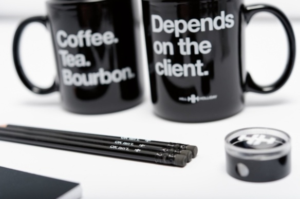
I appreciate any company whose branding leans heavily on quippy uses of office supplies. For one, few jobs are nothing but sparse workspaces and iPhones so of course you need good office supplies. And second, the products aren’t overbranded with the company’s logo but rather with the principles that guide the company.
I’m speaking of the new branding campaign for advertising giant Hill Holliday. They are using stark black and white with liberal Helvetica to create the brand message without using logo-fied golf shirts (don’t do it).
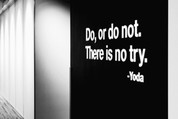
I love that they quoted Yoda on an office wall.
(via Under Consideration with a shout-out to Paper Pastries for the tip)


